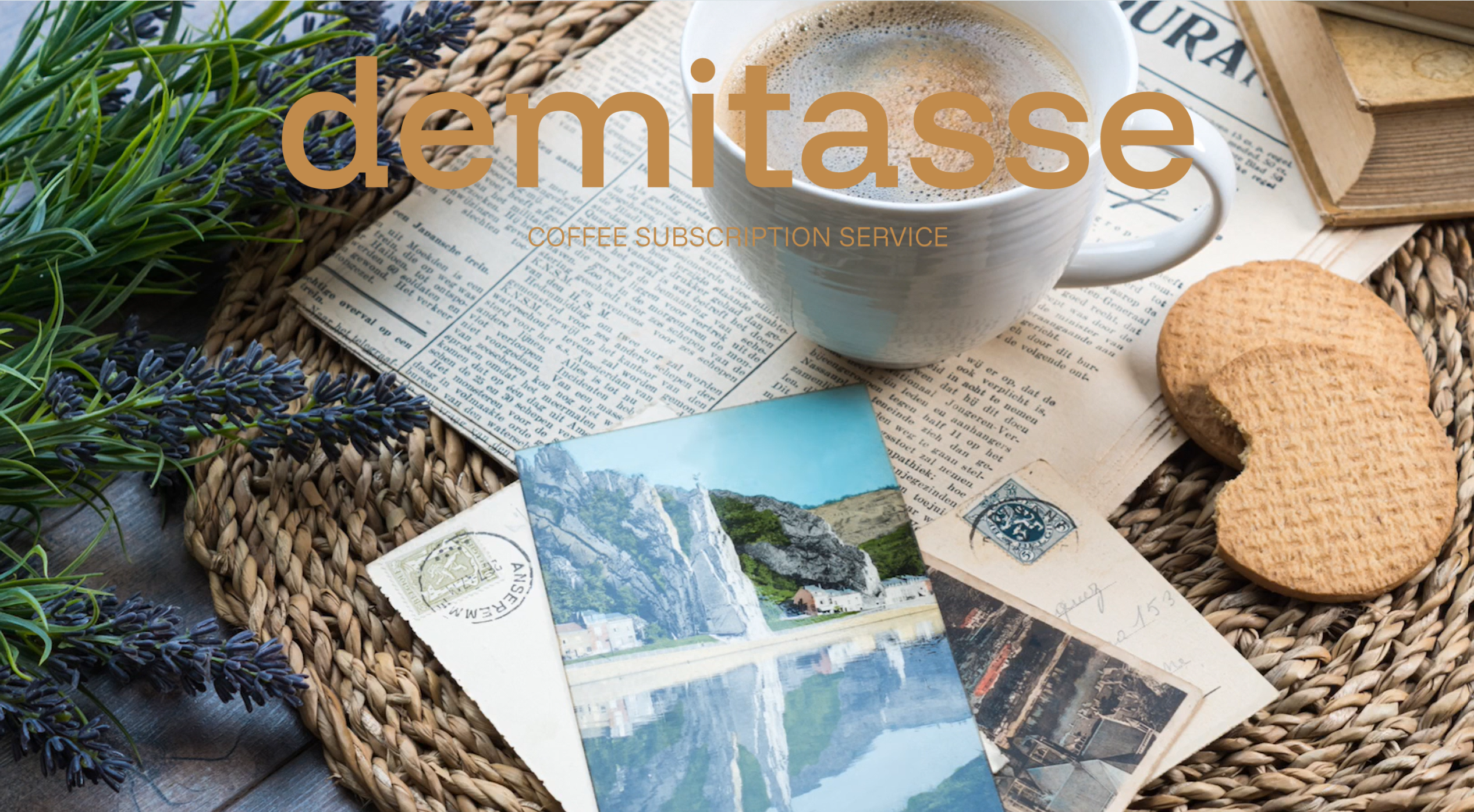
DEMITASSE COFFEE
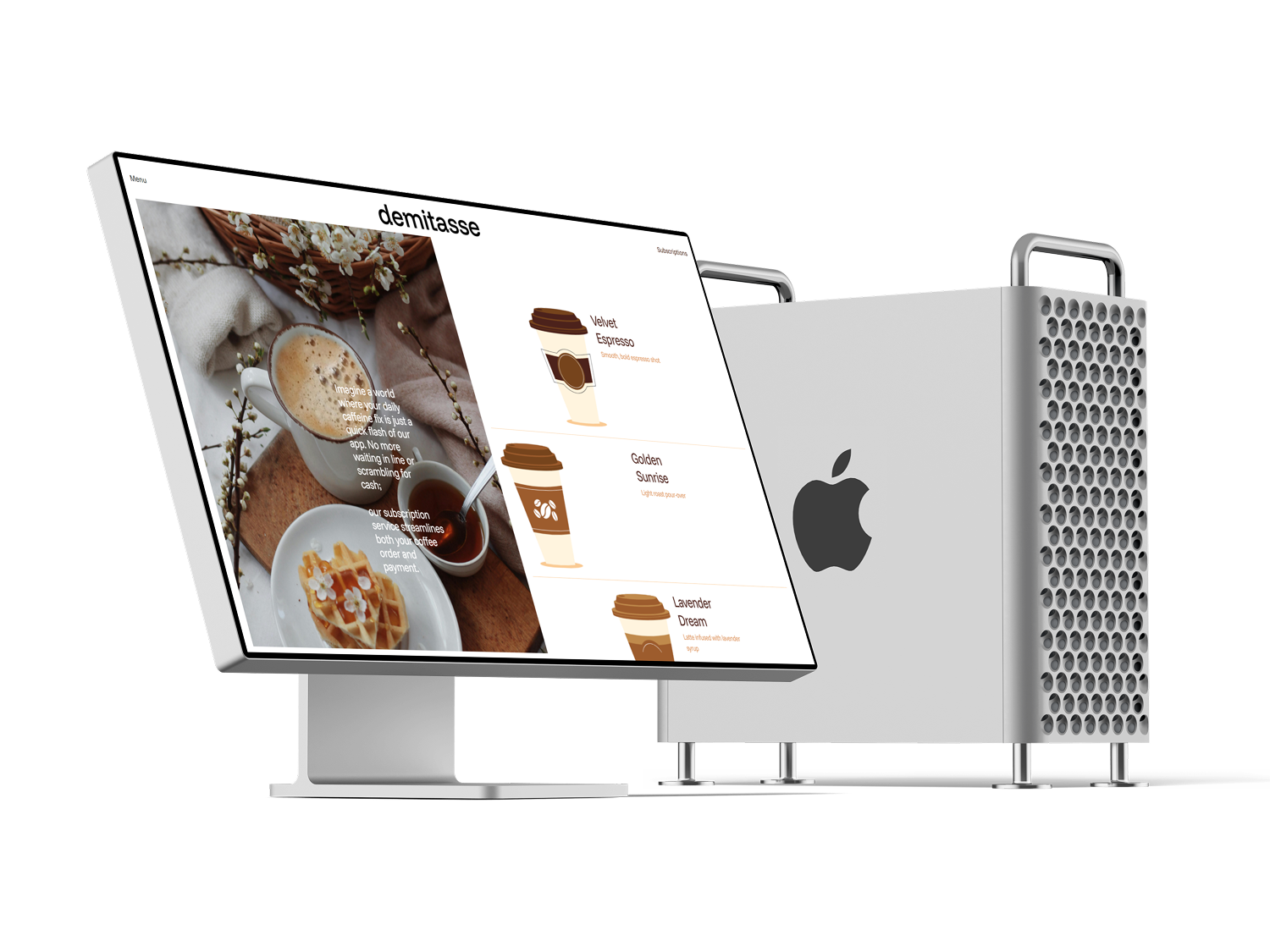
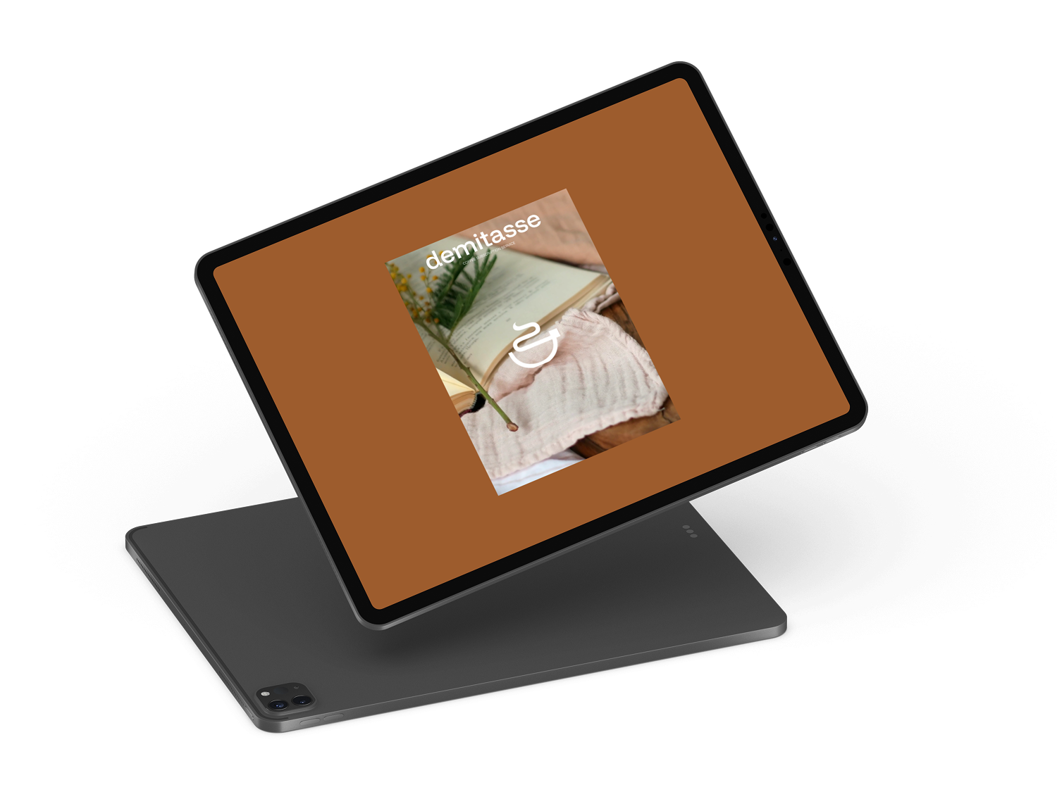
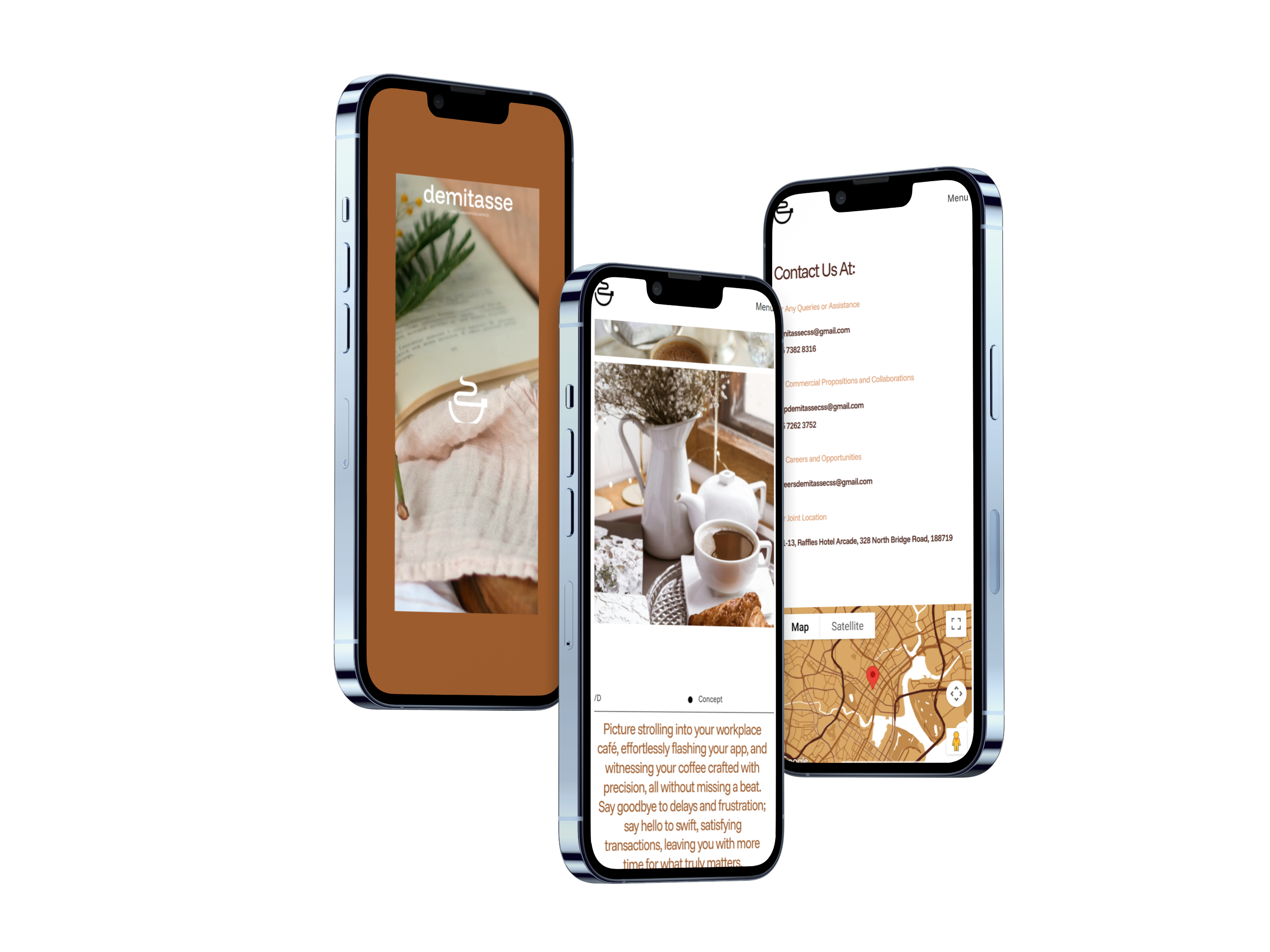
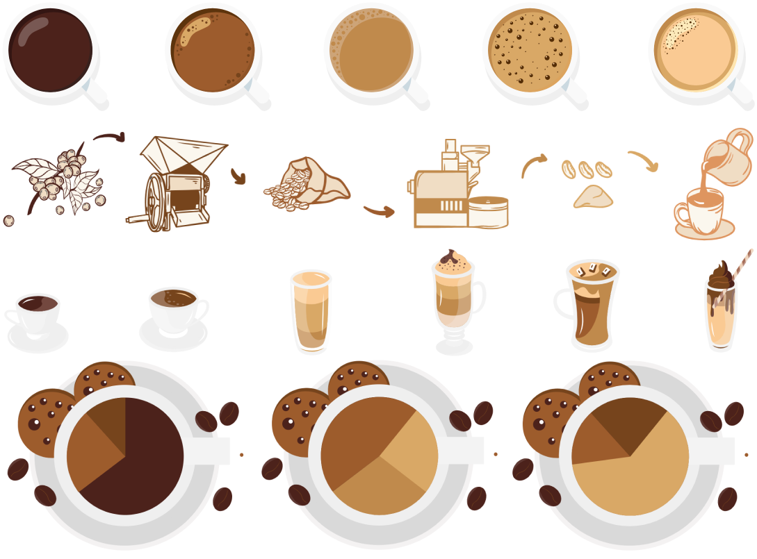
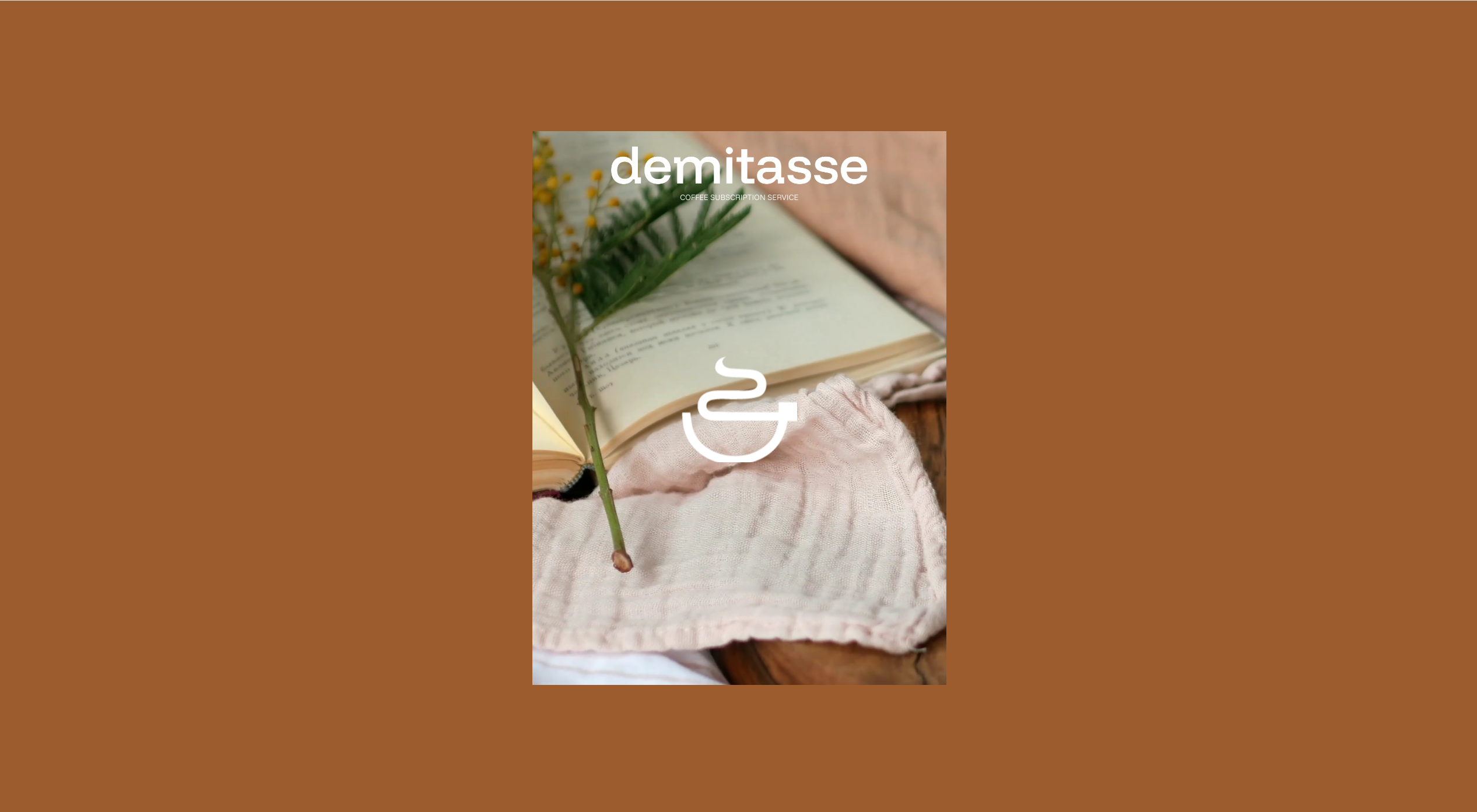
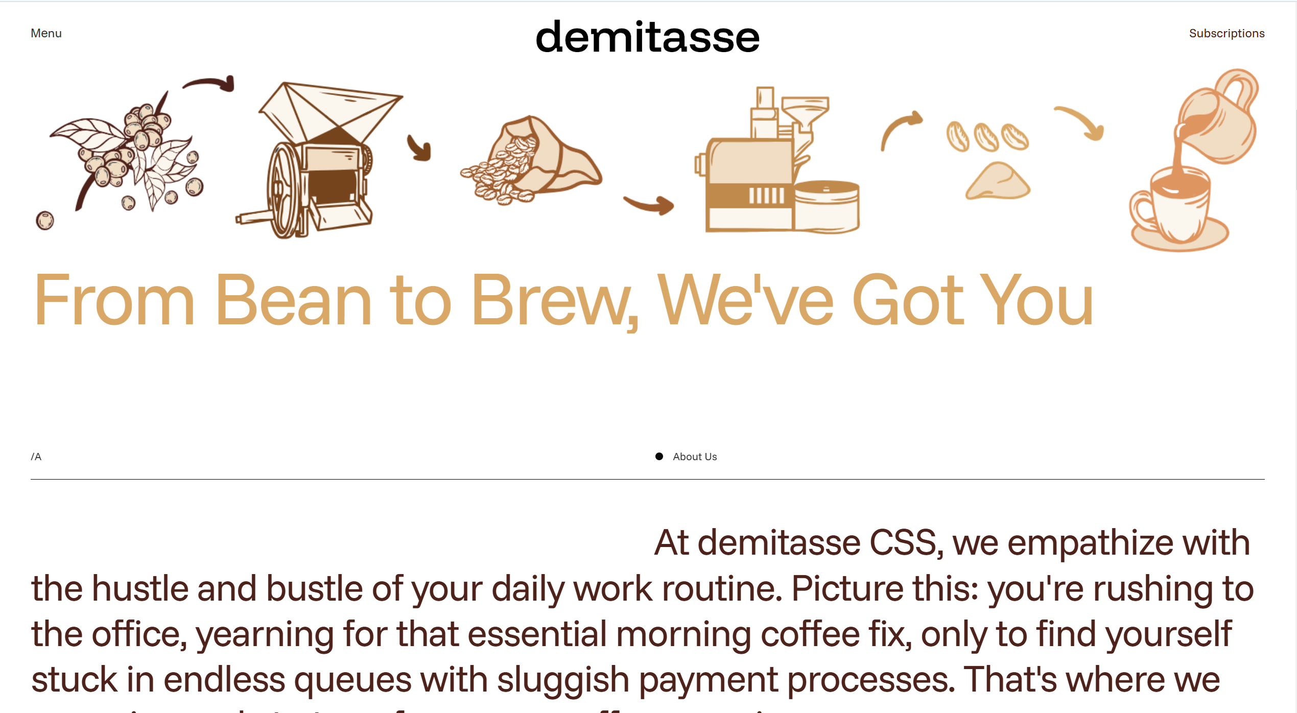
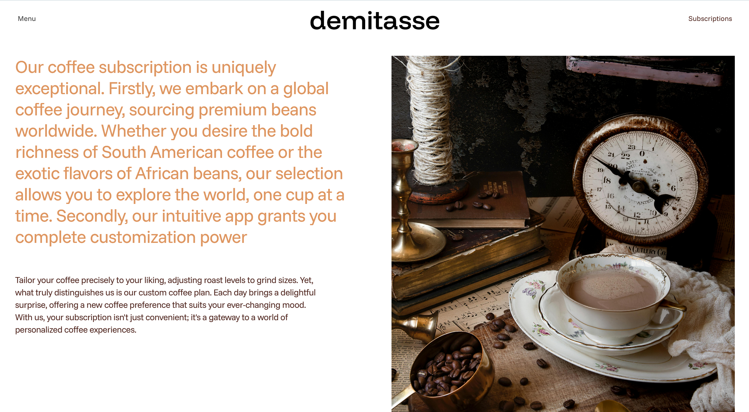
The branding for Demitasse is inspired by the refined, petite cups traditionally used by the elite. The website’s art direction reflects this theme, featuring carefully curated imagery of intricately patterned coffee cups, floral motifs, and elegant design elements to evoke a sense of sophistication and exclusivity. Care was taken to ensure a fluid, frictionless experience that exudes elegance across both desktop and mobile-responsive versions.
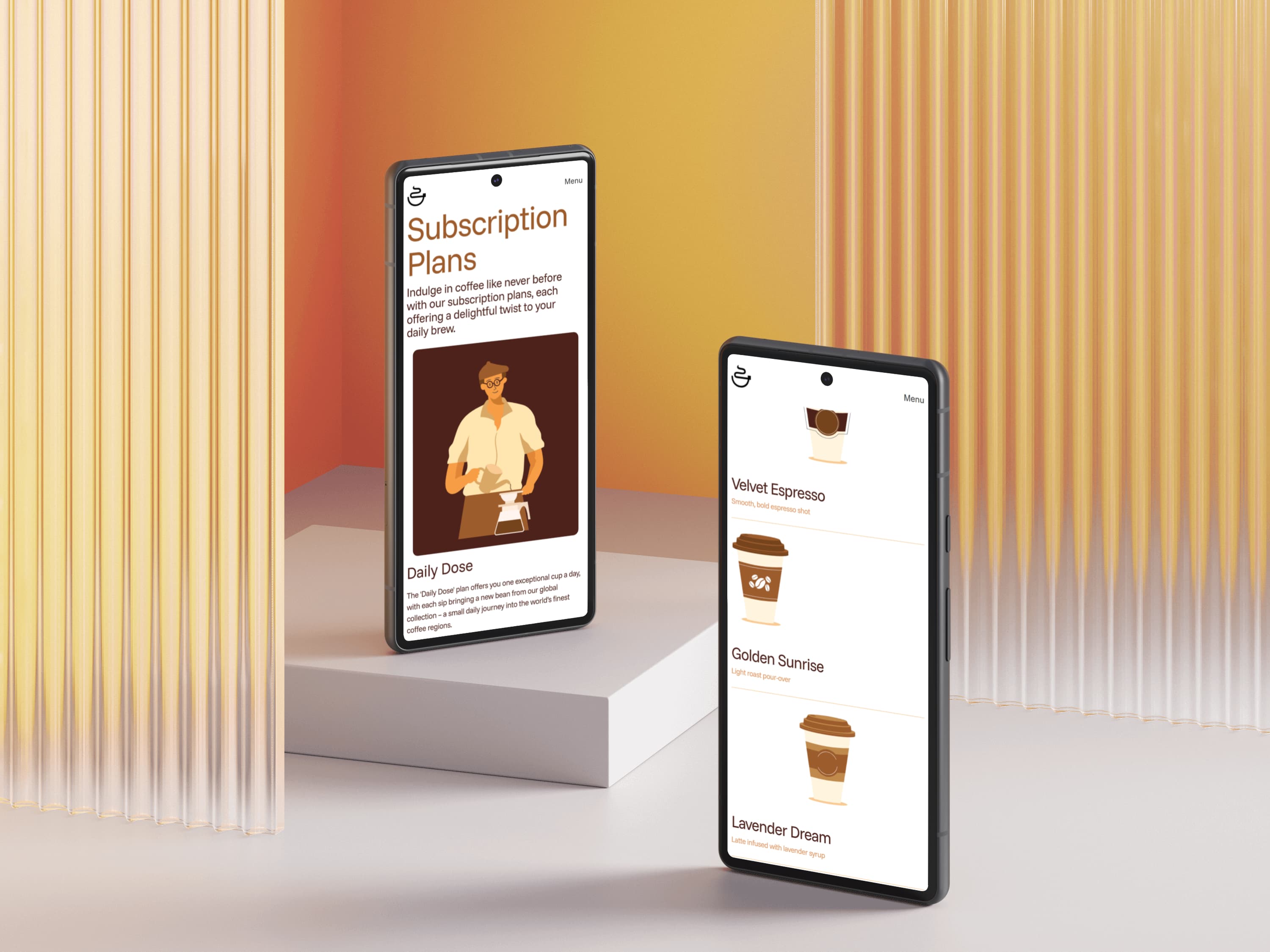
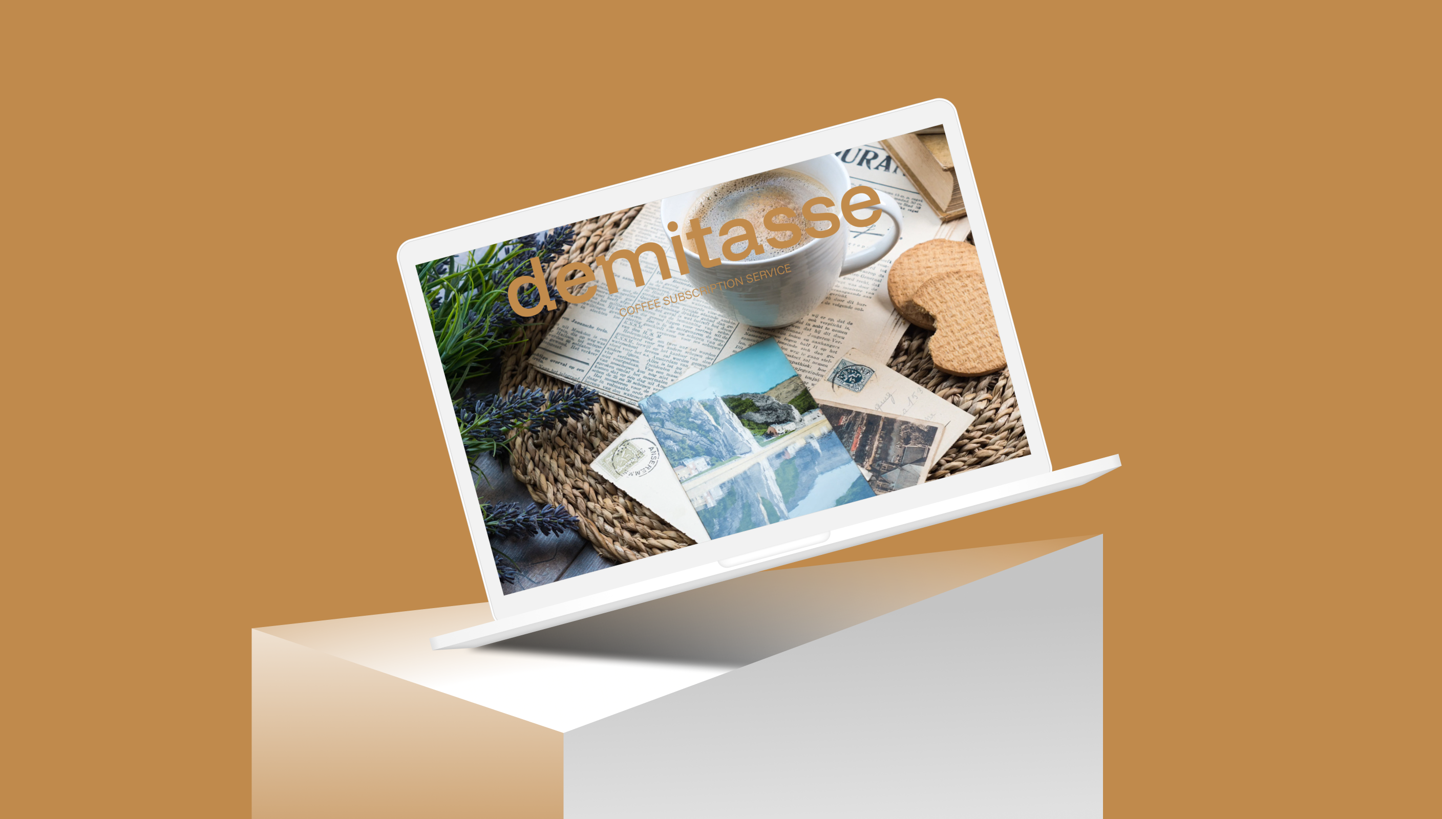
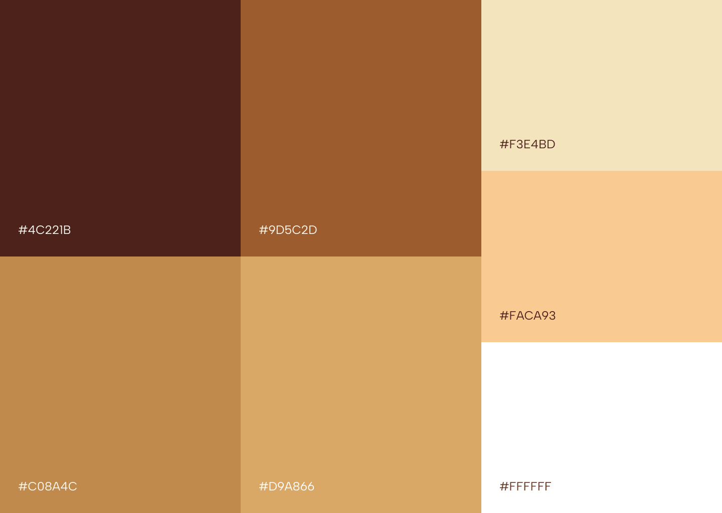
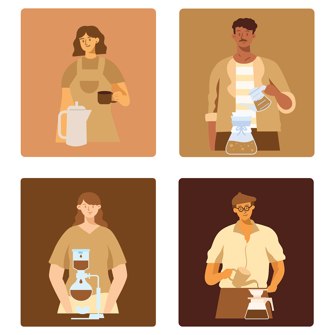
The chosen font family, "Funnel Display" and "Funnel Sans," stood out to me for its distinctive use of small squares, adding a subtle bitmap aesthetic. To ensure brand consistency, I designed a minimalist logo that follows the same concept, incorporating a square as a key structural element in the cup. This is complemented by a poetic choice of six shades of brown, reflecting the rich variety of coffee tones and reinforcing the visual identity along with visuals which have been sourced from the internet.

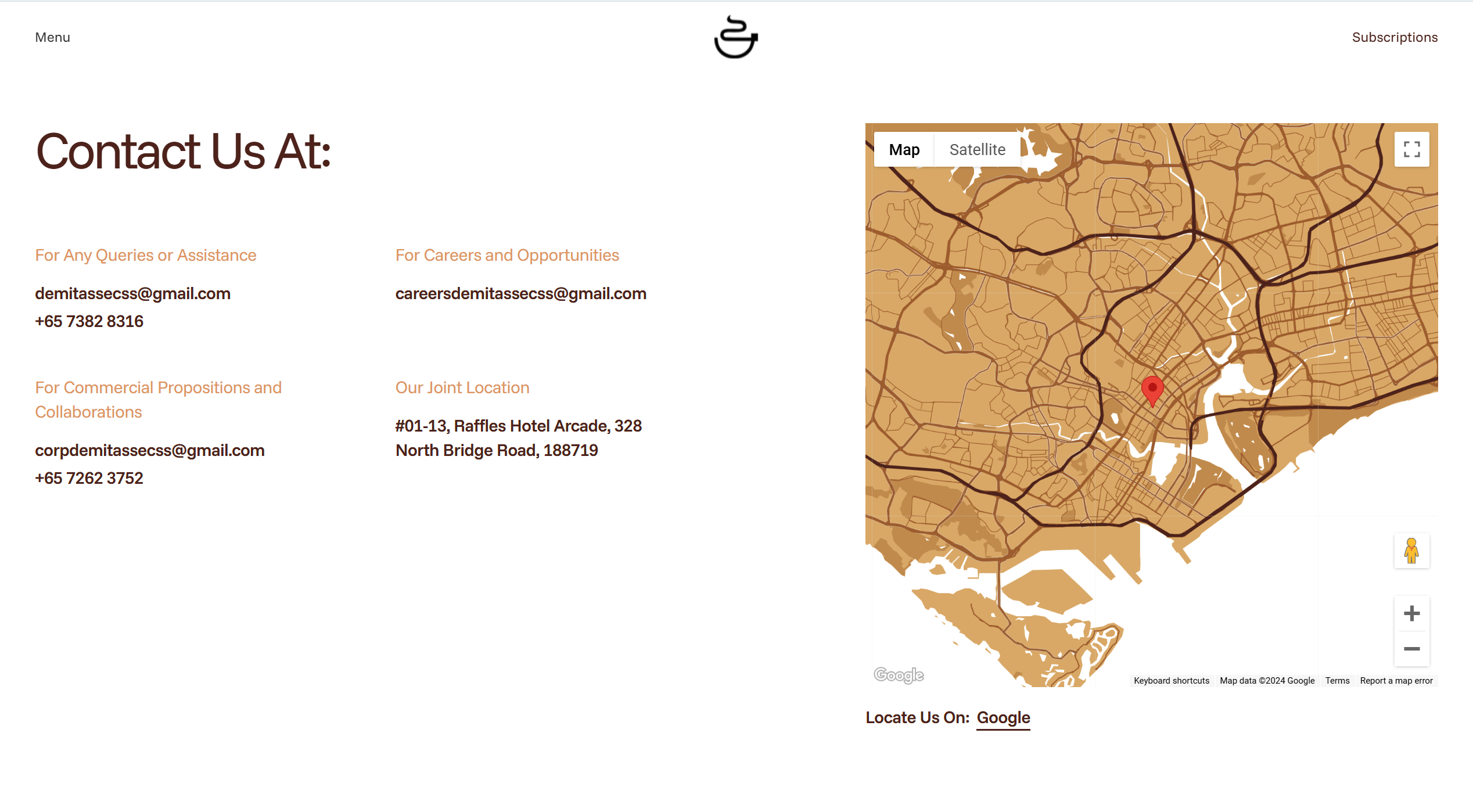
The map on the Contact Us page was customized using Snazzy Maps to align seamlessly with the brand’s visual identity. The same carefully selected color scheme was applied, ensuring a cohesive look that complements the overall design. This attention to detail enhances the user experience by maintaining consistency across all elements of the website.
Various header sizes and contrast variations were thoughtfully utilized to achieve smooth and harmonious typesetting. The expansive freedom of web space was leveraged to design pages with ample breathing room, fostering a relaxing and user-friendly environment.
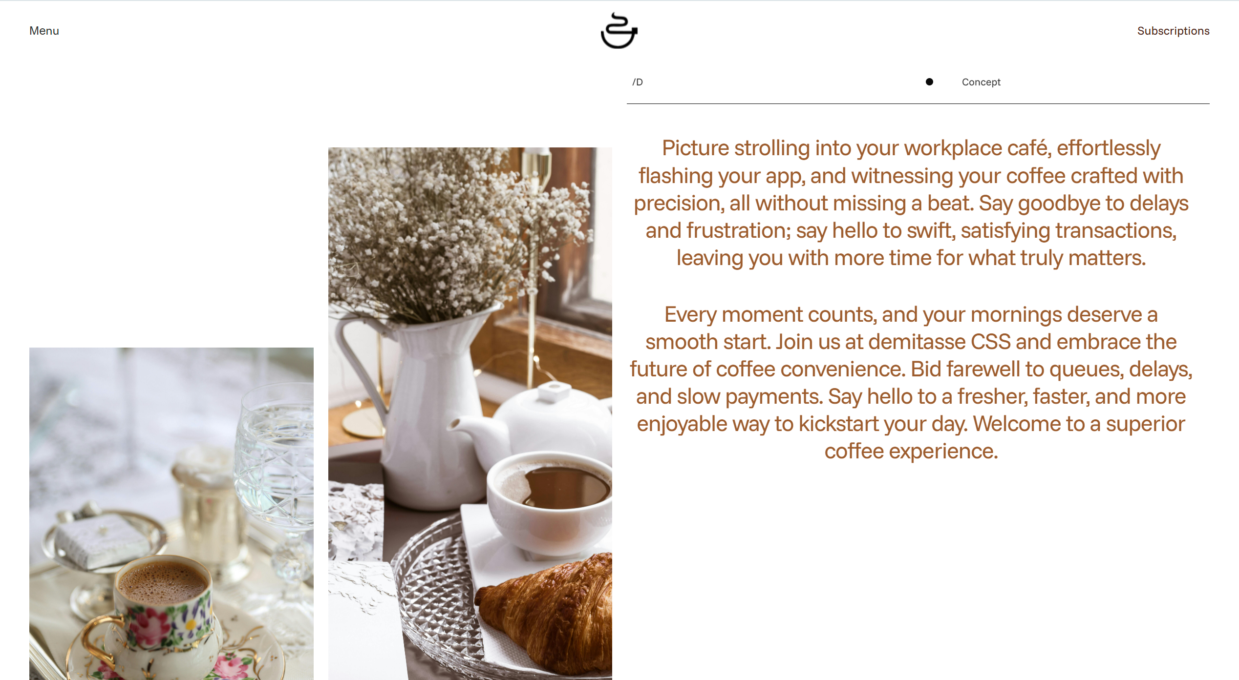
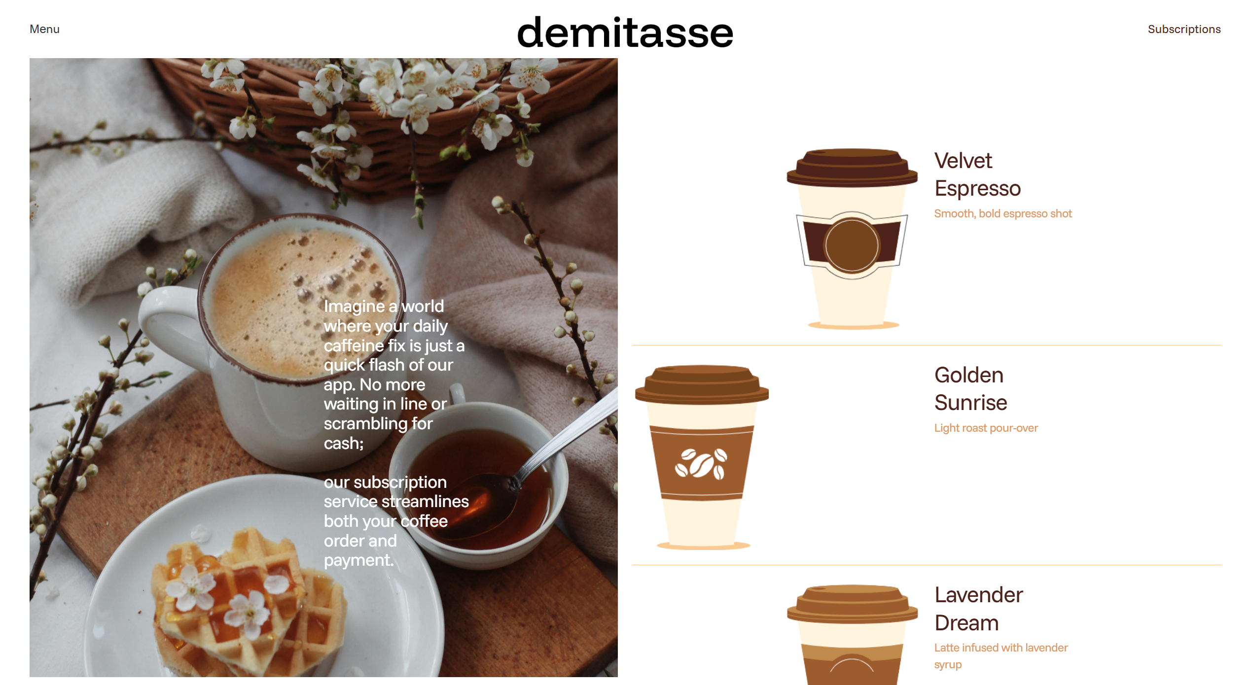
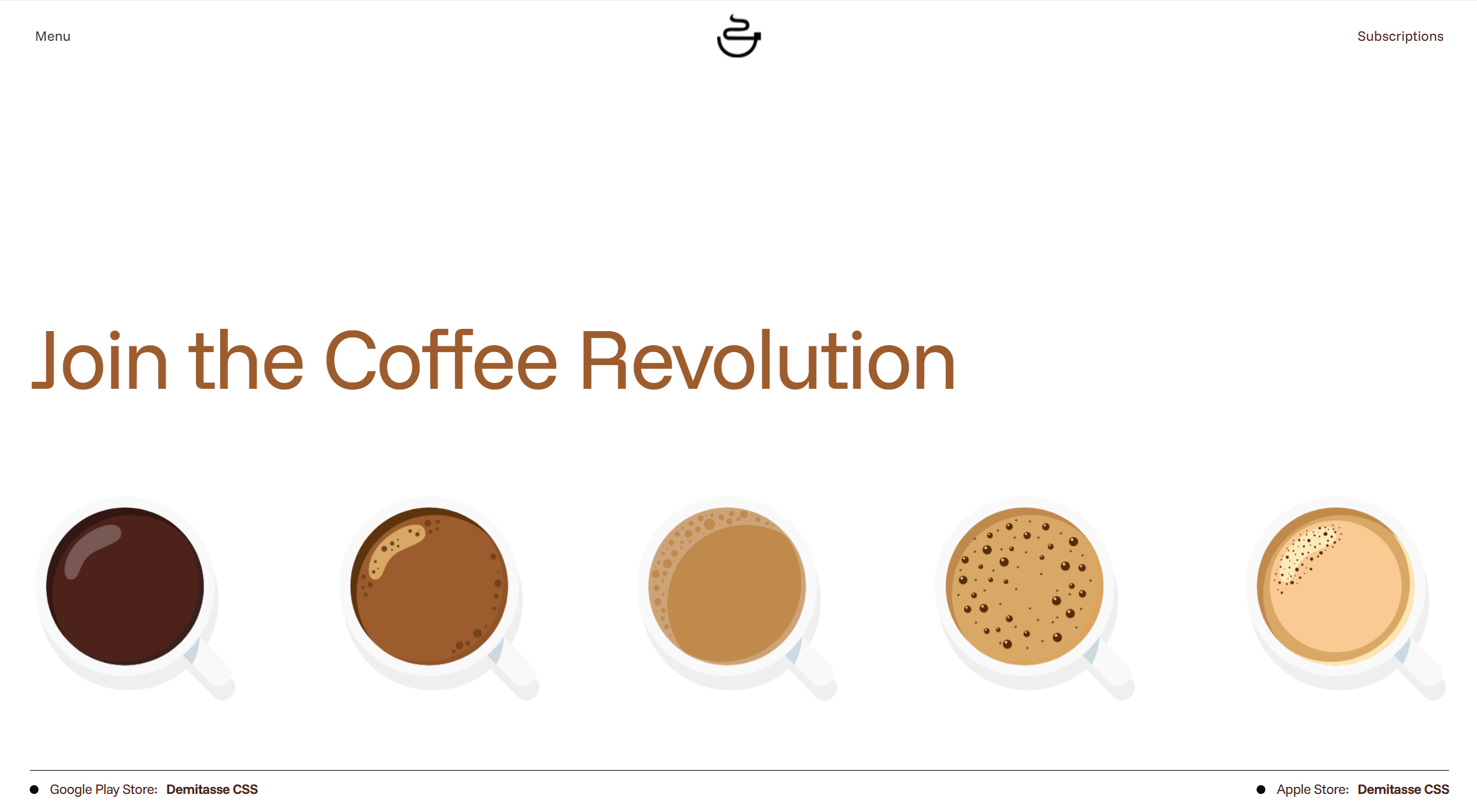
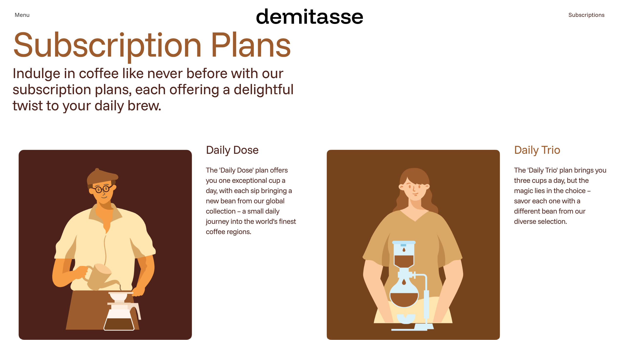
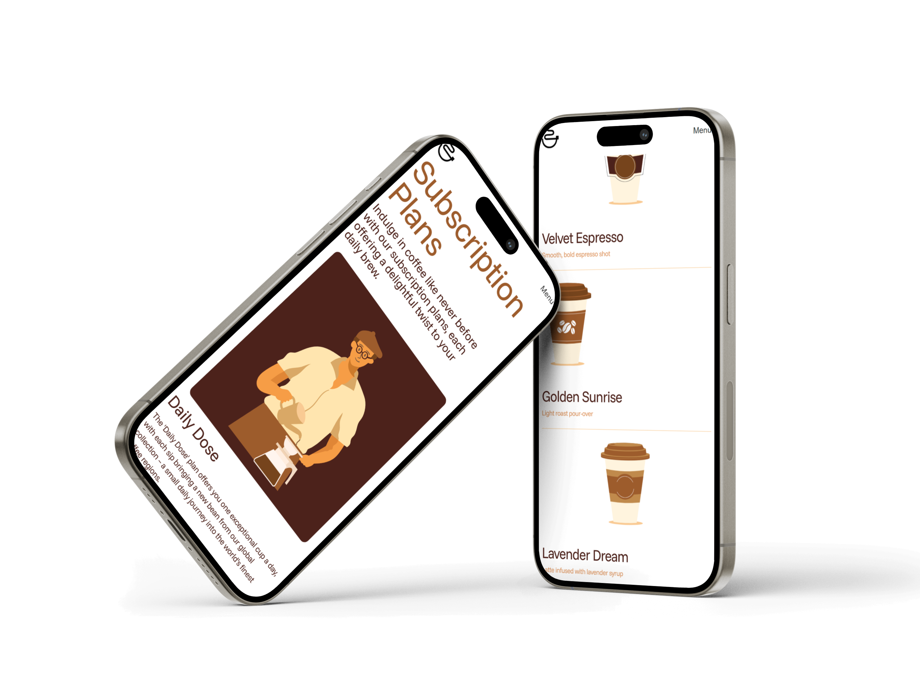
Demitasse's coffee subscription service brings the joy of freshly brewed perfection to your doorstep, offering convenience, variety, and the chance to discover new flavors with every cup, all at your fingertips through the app.